Designing a store is about much more than placing products and choosing colors. In retail design, every decision must serve a strategy, a traffic flow, and—above all—an experience.
Yet even well-established brands often make mistakes that directly impact sales, customer engagement, and brand perception.
In this article, we reveal the 7 common store design mistakes and how to avoid them with practical solutions, real examples, and professional tips.
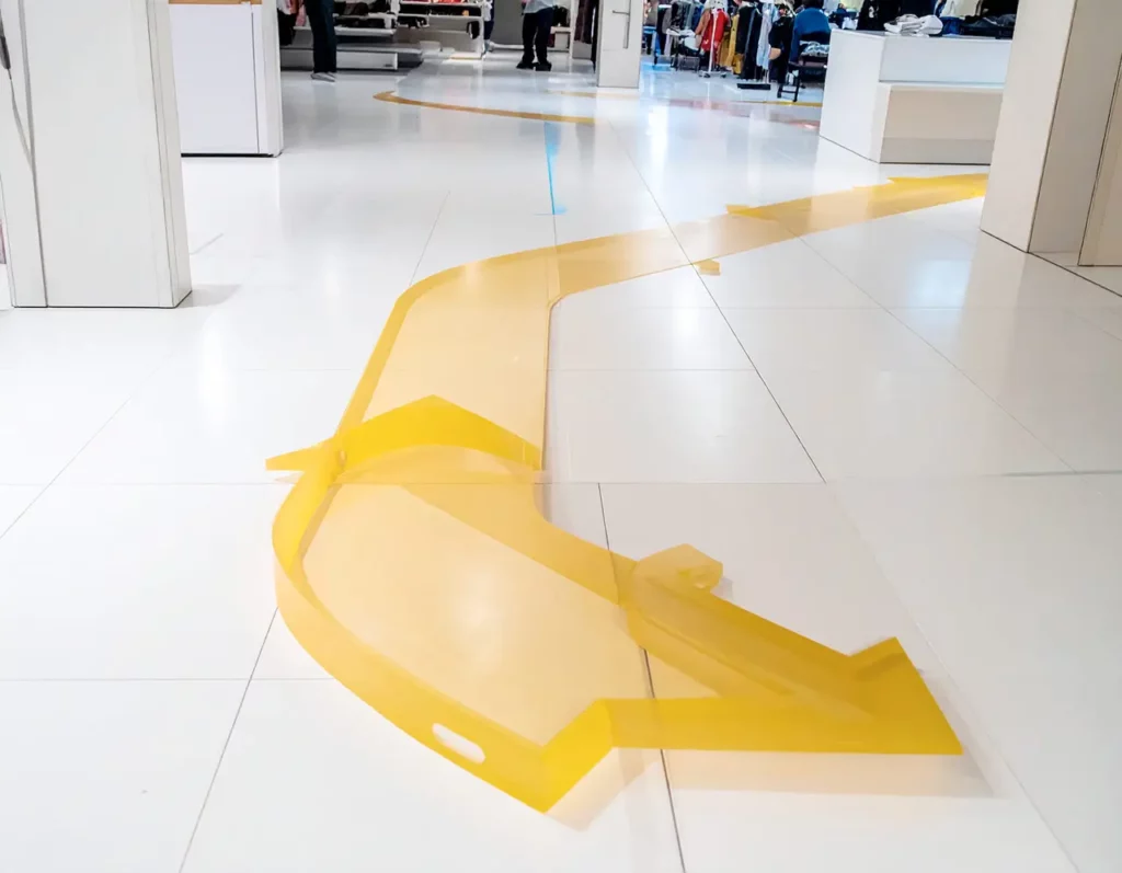
1. Not Defining a Clear Customer Journey
One of the most frequent mistakes in retail is failing to plan an efficient circulation flow. When a customer enters the store and doesn’t know where to start or how to move forward, they feel disoriented and frustrated.
The customer journey should feel natural, but be meticulously designed.
How to avoid it: Use visual merchandising strategies to guide visitors, combine hot and cold zones, and incorporate architectural elements to direct movement.
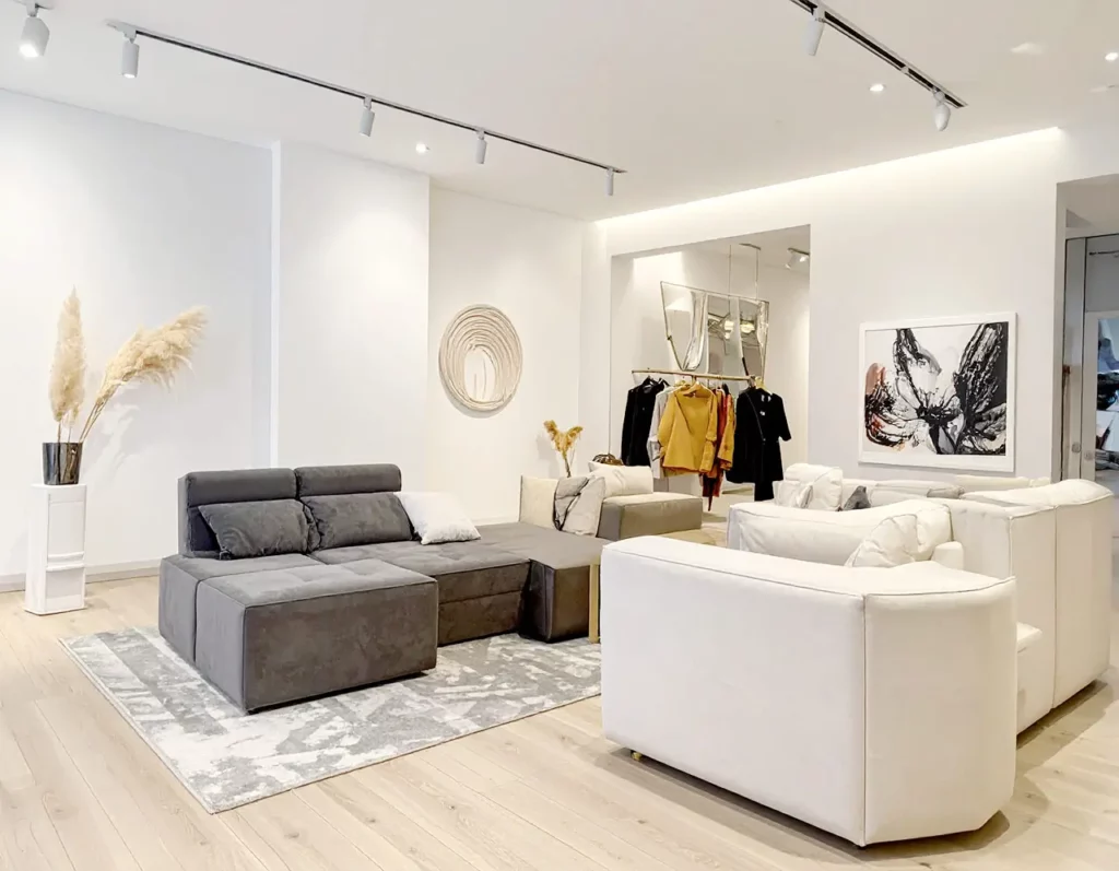
2. Poor Lighting Design
Generic or poorly placed lighting fails to create ambiance or highlight products.
Lighting doesn’t just illuminate—it sells.
How to avoid it: Design layered lighting systems—general, focal, and ambient. Use warm lighting in experiential areas and focused lighting on key products.
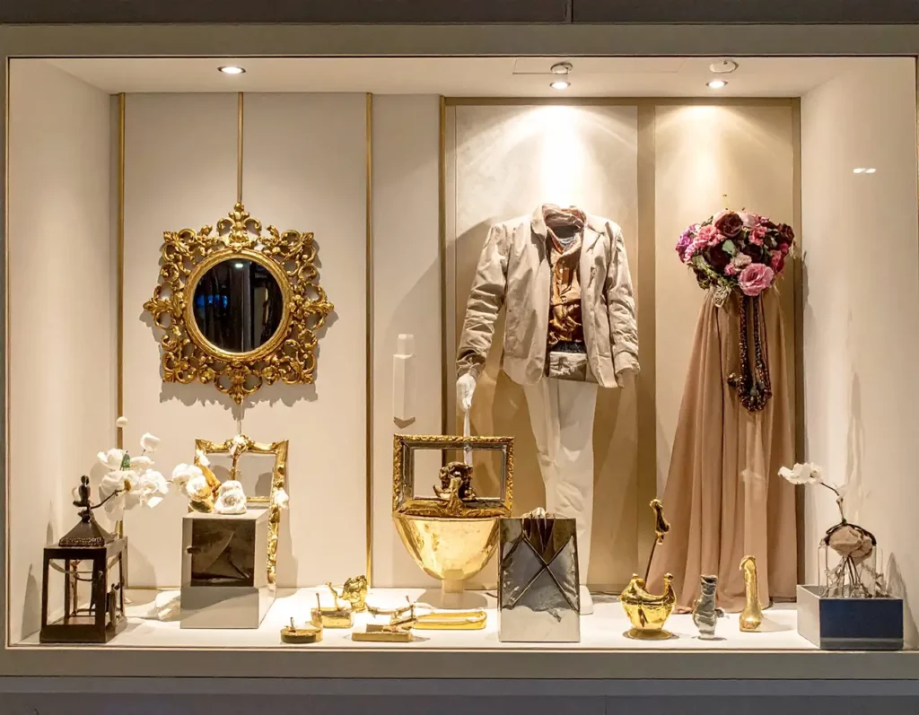
3. Ignoring the Power of the Window Display
Your shop window is your business card. A common mistake is to overload it, leave it outdated, or misalign it with your brand.
A well-designed window display can increase foot traffic by up to 30%.
How to avoid it: Change your window displays frequently, align the visual storytelling with seasonal themes, and work with a clear, engaging narrative.
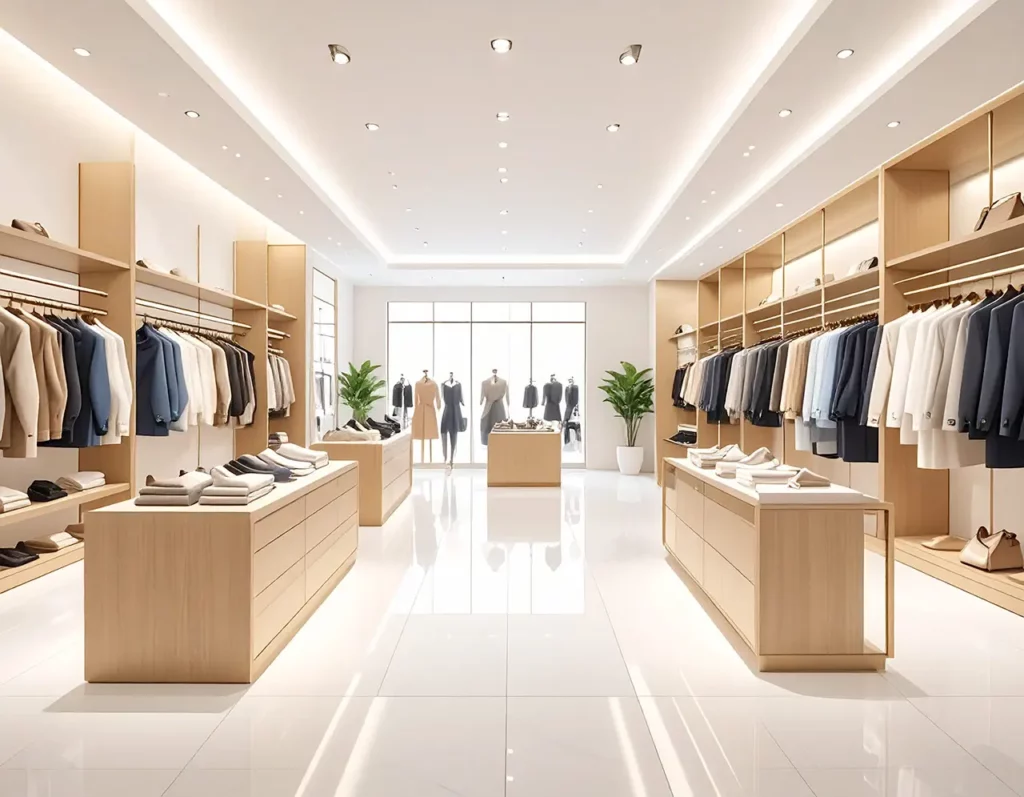
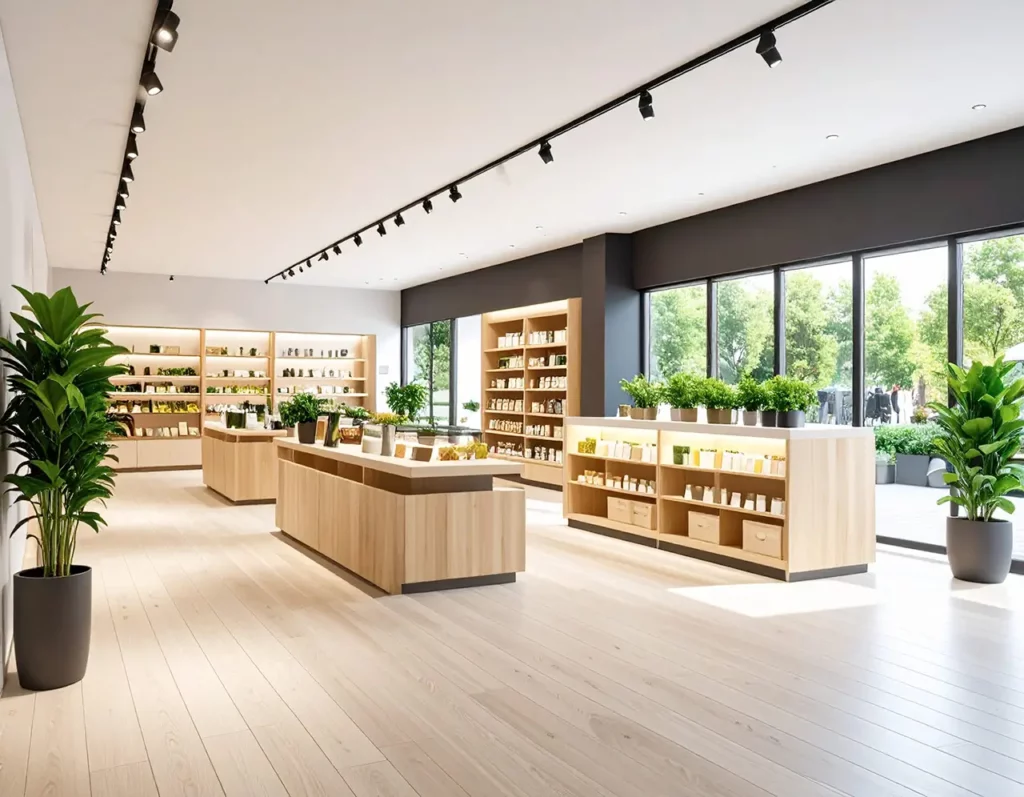
4. Overcrowding the Space with Products
Too many poorly placed items create visual chaos and overwhelm the customer.
Less product can mean more sales—if strategically displayed.
How to avoid it: Curate your selection, create focal points, and use negative space to elevate the overall composition.
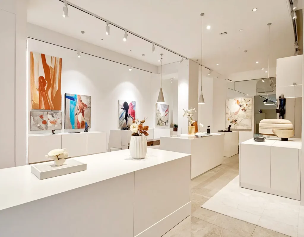
5. Lack of Consistency Between Design and Branding
Your store design should be a physical extension of your brand universe. When there’s inconsistency, the message loses strength.
Retail design is three-dimensional branding.
How to avoid it: Use color palettes, materials, and typography aligned with your visual and verbal brand identity.

6. Overlooking Customer Emotions
A space can be visually stunning but emotionally flat. This disconnects customers from the experience.
How to avoid it: Introduce scents, textures, music, and relaxation areas that connect with your audience on a sensory and emotional level.
7. Forgetting About Adaptability
Rigid designs that can’t evolve with new collections, seasons, or formats are a common trap.
How to avoid it: Choose modular furniture, mobile structures, and flexible solutions that allow for quick and easy reconfigurations.
Inspiring Case Studies: Storefronts that Make a Statement
Louis Vuitton – Escaparates cinéticos (Paris, 2023)
Louis Vuitton turned its Champs-Élysées windows into kinetic installations. Rotating structures with LED lights and mirrors interacted with passers-by. This bold concept reinforced the brand’s high-tech luxury identity and went viral on social media. A prime example of a window as a living performance—captivating, emotional, and product-light.
Hermès – Poetic Scenography (Milan, 2022)
Hermès created dreamlike window displays in Milan using recycled paper and fine textiles. Each one told a micro-story inspired by the collection, enhancing emotional connection with the visitor. A brilliant showcase of how visual storytelling and set design can turn a window into a brand-driven piece of art.
Zara – Emotional Minimalism (Barcelona, 2023)
Zara revamped its flagship on Passeig de Gràcia with a minimalist approach: warm lighting, natural materials like stone and wood, and no mannequins. Instead, art installations communicated values like sustainability and modernity. Proof that minimalism, when executed well, can be emotional, welcoming, and commercially powerful.
Nike – Interactive Activation (New York, 2022)
Nike incorporó pantallas táctiles, sensores de movimiento y realidad aumentada en sus escaparates de la tienda de Soho. Al interactuar, los usuarios desbloqueaban experiencias, promociones y acceso anticipado a lanzamientos. Este ejemplo demuestra cómo el retail puede fusionarse con la tecnología para crear una experiencia phygital que conecta y fideliza a un público digitalmente nativo
Nike’s Soho store windows featured touchscreens, motion sensors, and augmented reality. Shoppers who interacted with them unlocked experiences, promotions, and early product releases. A striking example of phygital retail that merges physical and digital to engage a tech-savvy audience.
.
Conclusion: Store Design Leaves No Room for Guesswork
Avoiding the most common store design mistakes isn’t just about aesthetics—it’s about strategy.
Every decision—from product layout to lighting tone—directly affects brand perception, customer behavior, and, ultimately, your sales.
This article has broken down the 7 common store design mistakes, offering practical, real-world solutions and successful brand case studies to inspire your retail strategy.
In summary:
- The customer journey must be carefully mapped.
- Lighting and window displays are persuasive tools.
- Brand consistency must be present in every detail.
- Less is more—when the space is well planned.
- Emotions and adaptability aren’t optional—they’re essential.
As designers, visual merchandisers, or brand managers, our challenge is to create spaces that not only look good—but truly connect, build loyalty, and stand out in a saturated market. Avoiding these common mistakes is the first step toward a store that truly works.
Ready to review your retail space and turn mistakes into opportunities?